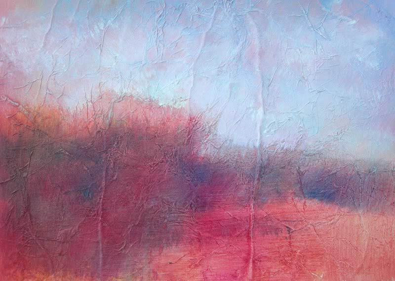
Sunday, August 30, 2009

Start With Red

Summer Scrub
Another one of the "start with red" series (I never know they are really a series until after.......but it makes sense that they will have the same feel when I paint them at the same time) Again with the big brush and using it really dry along the middle ground to create the feeling of shrub and brush and scrub. Letting it sit and then returning with the simple pale blue-white sky. Busy foreground means a quiet sky for balance. Complicated sky means simple foreground. Sometimes its really that simple.
I changed my header picture to a photo I "stitched" together from a recent sunrise. Inspiration for future paintings........

Digg!
submit to reddit

Simple Bright Land

Simple
This started as a red piece of primed watercolor paper. Thinking about the simple combination of colors and the simple composition, A real tribute to STOPPING soon enough. I used my usual 3 inch wide brush and laid on the purple to blue shapes....then...STOP. Letting it rest is really hard. I either walk away or move on to another painting ( in this case I had three primed watercolor papers ready with the red undercoat) so I did two other quick paintings at the same time (to be featured in future posts.......) as  usual I had added tissue paper to the primed watercolor paper. This particular paper ended up giving me vertical lines as part of how the surface took the paint.  Ghostlike tree trunks or cosmic lightening strikes????? After waiting or walking I came back to this painting and added in the plain misty sky line with a very dry brush and the very flat sky.  Pretty happy with simple.......submit to reddit

Digg!

Thursday, August 27, 2009

Heaven Sky

Heaven Sky
More from the poured painting group. I ended up with quite a few good paintings picked out of larger paintings. These are on primed masonite and are pretty small....only 8X8 (inches).
Hardly big enough to make a difference in the world of big, bold paintings.
 I like these square ones on small easels as part of a grouping. I have also mounted the 8x8 square on a larger background board of textured luan to give it more power.... submit to reddit

Digg!

Saturday, August 22, 2009

Lovely Looking Sky

Lighted Sky
Another attempt at SIMPLE. Close colors and the lit sky above the simple shapes of the landscape. lots of texture on the surface by adding tissue paper before the paint. Not a very big painting...just a quiet little piece of art.

Digg!

submit to reddit

Thursday, August 20, 2009

First Light - Poured Painting

First Light
A poured painting picked out of a larger poured painting.
This on primed masonite.
I primed both sides with two or three coats of gesso and let it dry.
Then I added a thinned layer of drywall compound with a bristly brush allowing it to leave some brush marks for texture.
Then.....
the fun part.
Start pouring paint.
Some happy accidents here ...from the pink and yellow of the sky to the maroon mountains that showed up.
These masonite boards have to take a lot of saturating with the liquid paint so priming both sides is the key...as many coats as you can ( Yes, the tedious prep work) but worth it to keep the finished art from warping.
These paintings are for everyone who thinks they can't paint...because they CAN.
The paint does all the work.

Tuesday, August 18, 2009

Painted Newspaper Package

Leaf Detail
This from the top of the package...little leaves made of primed and painted newsprint. I cut them into freeform leaf shapes and added the veining with paint in bottles with a pointy tip. (Probably used for fabric painting)
Newspaper Bow
Looks like a cabbage or a mum but it IS really the bow for the top of the package. Got a little out of hand and threatening to overtake the whole package........ Strips of primed and painted newsprint glued to a square light cardboard base and just layered and layered and layered. It started out as loops of newspaper and then I ended up cutting the loops open to try to release some of the form. Having to think in 3D and about the sculptural qualities. I wanted it to be different but it's OK for a first attempt....

The Present itself
Wrapped in painted newsprint. I gessoed it and then added the colors and folded them into each other ( sort of like cooking!) When the muted background was dry (pink,rose, gold and white) I added on the white hearts randomly with a stencil I had cut. I had to tape two pieces together to fit the box completely so I planned ahead a littel to try to make two similarly painted pieces of painted newspaper.


A close-up of another newspaper wrapping paper idea. Similar to the present but with the red hearts.


This is the bigger sheet of the red heart wrapping paper. Liking the variation in color on the background and the random placement of the hearts. I'm working on more wrapping paper and card ideas from the painted newspaper. Liking the idea of creating, using and discarding the painted paper in the shape of the I Ching...all about change. ( Thanks to Erin Mishalanie!)


Wednesday, August 12, 2009

Decisions, Decisions

Red Rocks Original

Red Rocks1

Red Rocks 2
The top painting is the original poured painting.
I poured thinned acrylic over gessoed watercolor paper that I had taped to a backing board.
These paintings get so saturated with paint that even with several coats of priming and secure taping onto the board they still can begin to lift and buckle.
(Learned after trial and error and turning a great start of a painting into a wrinkled mess...)
So they HAVE to be given time to dry between pourings. And if they are getting really wet the colors will just bleed so badly into each other that......
mud happens.
Happy surprises
await if I can be patient.
The two vertical pictures above are parts of the original painting that I am considering as single paintings on their own.
In this case I used Photoshop Elements to crop the original digitally
but I also have a few matboards cut into squares and narrow horizontal/verticals to lay on the dried painting and pick out the smaller paintings.
Even the "worst" original painting has parts that are salvageable with cropping.


Digg!

submit to reddit

Tuesday, August 11, 2009

Flowers Now and Then

Geraniums Summer 2009
Watercolor Gladiola 1999

Watercolor Daffodils 1999
So in celebration of my first sale on www.Etsy.com a look at the progress I've made on painting florals.
The watercolors were part of the process and a good step to letting the paint go where it wants. I had watercolor lessons in the summer of 1970 when I was 13 and just had no idea of transparency and the white of the paper. (I wish I still had those first paintings just to track the progress. ) They were heavy and dark and horrific but typical ( I think) of first attempts.
In the almost 30 years since
I clearly made progress and was happy with these florals in 1999.
But......pushing onward.
The geraniums (recently sold on www.Etsy.com) evolved from all the paint throwing that I have been doing and the conpletely abstract newspaper paintings seen in previous posts.
Apparently I needed to swing wildly to that end to free up the structure of the florals. The geraniums ended where they did because in frustration I used a rag that was handy and blotted the paint into a more impressionistic place. Also some mental shift was required to allow what was trying to be a very rigid representation of geraniums to soften into the suggestion of geraniums. I kept working the painting until I got what you see here but walking away for a while is sometimes another choice.